10 Cozy Winter Paint Colors for Arizona Homes
- Michael Toro

- Jan 12, 2025
- 5 min read
Updated: Mar 24

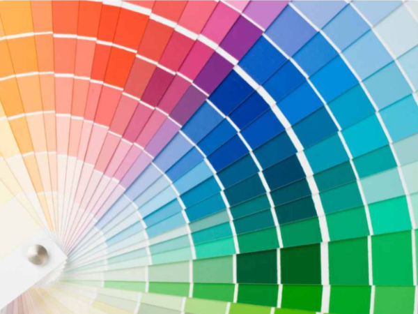
Winter in Arizona brings mild days, cooler evenings, and the perfect excuse to make your home feel warmer inside. Choosing the right winter paint colors for your Arizona home can help create a cozy, inviting space that feels comfortable all season long. From earthy greens and rich browns to soft warm neutrals, these shades can add warmth, depth, and personality to your interior.
Top Cozy Winter Paint Colors for Your Arizona Home
Benjamin Moore’s “Louisburg Green”

A warm, olive-based green that brings the feeling of nature indoors. This shade creates a peaceful, grounding effect, ideal for Arizona’s winter season when the desert landscape starts to cool. Pair it with warm wood accents or soft beige furniture for a perfectly balanced look.
Where to Use: Living rooms and bedrooms.
Why It Works: The natural tones evoke feelings of comfort without being overpowering.
Sherwin-Williams’ “Warm Stone”

This taupe-gray shade feels earthy and grounding, offering a cozy neutrality that works well in open spaces. It pairs beautifully with soft whites or muted greens for a layered, sophisticated effect.
Where to Use: Dining rooms or transitional spaces like hallways.
Why It Works: Its neutral undertones provide warmth without dominating the space.
Farrow & Ball’s “London Clay”

This deep, rich brown with hints of magenta is the perfect choice for adding depth and elegance to any room. It’s bold yet inviting, ideal for creating a luxurious, cozy retreat.
Where to Use: Accent walls in bedrooms or studies.
Why It Works: It wraps the room in a sense of intimacy, perfect for chilly evenings.
Pantone’s “Mocha Mousse”

A rich, velvety brown inspired by chocolate, coffee, and earthy spices. This shade adds warmth and sophistication, making any space feel indulgent yet grounded.
Where to Use: Living rooms or kitchens with natural light.
Why It Works: The perfect balance of indulgence and approachability ensures it works year-round while offering cozy vibes for winter.
Benjamin Moore’s “Baby Fawn”

This creamy off-white has just a touch of greige, making it a warm neutral that doesn’t feel too stark. It’s ideal for those who want a clean, classic look with a bit of softness.
Where to Use: Entryways, bathrooms, or anywhere you want to maximize light.
Why It Works: Its reflective qualities brighten rooms while maintaining a cozy feel.
5 More Cozy Winter Paint Colors for Arizona Homes
If you’re still searching for that perfect shade to make your home cozy and inviting this winter, don’t worry—I’ve got five more stunning options that fit right into the season's aesthetic. These colors are warm, versatile, and designed to complement any winter décor while keeping your home feeling comfortable and stylish.
Valspar’s “Fired Earth”

A rich, terracotta-inspired hue with subtle orange undertones, "Fired Earth" brings a sense of warmth and vibrancy to any space. Its earthy tones make it a standout choice for winter, offering a cozy feel without being too bold.
Where to Use: Dining rooms, kitchens, or feature walls in living spaces.
Why It Works: The warmth of this color radiates throughout the room, making it feel lively and inviting.
Behr’s “Nature’s Gift”

A muted sage green that is both calming and cozy, "Nature’s Gift" adds a touch of winter greenery indoors. Its soft yet rich hue works perfectly for creating a warm and refreshing atmosphere.
Where to Use: Bedrooms, living rooms, or kitchens.
Why It Works: This green feels like a breath of fresh air, balancing nature-inspired serenity with winter coziness.
Farrow & Ball’s “Brinjal”

A dramatic, deep aubergine with red undertones, "Brinjal" is perfect for adding luxury and depth to your home during the cooler months. This bold color wraps rooms in richness and works beautifully with gold accents or plush textures.
Where to Use: Accent walls, studies, or powder rooms for a sophisticated flair.
Why It Works: Its dark, moody vibe creates a cocoon-like effect, perfect for chilly evenings.
Sherwin-Williams’ “Reddened Earth”

This warm, dusty red exudes a desert-inspired charm while remaining cozy and modern. It’s a unique color choice that bridges the gap between bold and subdued, making it perfect for winter in Arizona.
Where to Use: Dining rooms, entryways, or even fireplaces for a striking pop of color.
Why It Works: Its natural, earthy quality makes it stand out while still feeling grounded and approachable.
Benjamin Moore’s “Van Courtland Blue”

A soft, smoky blue with subtle gray undertones, "Van Courtland Blue" offers a refreshing yet warm vibe that’s perfect for winter. It brings a peaceful sophistication to any room.
Where to Use: Bathrooms, bedrooms, or studies for a calm, soothing ambiance.
Why It Works: This blue strikes a balance between cool and cozy, making it ideal for the winter season and beyond.
How to Choose the Right Winter Paint Color
Choosing the perfect winter paint color isn’t just about picking something you like—it’s about understanding how it will work in your space.
Here’s what to keep in mind:
Consider the Light
Winter light is softer and cooler, especially in Arizona. This means warmer tones will shine brighter and create a welcoming atmosphere.
Think About the Room’s Function
Warmer shades like deep browns or muted greens work well in living rooms and bedrooms, while neutrals are ideal for kitchens or bathrooms.
Sample Before You Commit
Always test paint samples on your walls to see how the colors look at different times of day. Arizona’s unique lighting can dramatically change how a color appears.
Layer Your Colors
Pairing a warm wall color with complementary furniture, curtains, or accents can enhance the cozy vibe. For example, a deep green wall looks stunning with creamy whites or brass fixtures.
Why Winter is Perfect for Interior Painting
Winter is a great time for interior painting in Arizona. Cooler weather and milder indoor conditions can make painting projects more comfortable, while softer seasonal light can help you evaluate color more carefully.

A Final Word on Winter Color Trends
Whether you prefer warm neutrals, earthy greens, deep browns, or muted statement colors, the right winter paint color can make your Arizona home feel more comfortable and inviting. If you are planning an interior painting project this season, start by testing a few samples in your space and watching how they look throughout the day.
Frequently Asked Questions About Winter Painting
What are the best paint colors for winter in Arizona?
Warm, earthy tones like olive green, taupe-gray, and deep brown are perfect for creating cozy interiors during Arizona winters.
How does Arizona’s winter light affect paint colors?
The softer, cooler light of winter enhances warm tones and earthy shades, making them appear richer and cozier indoors.
Should I test paint colors before committing?
Yes, always test samples on your walls to see how they appear under different lighting conditions throughout the day.
What are some versatile winter paint colors?
Shades like Benjamin Moore’s “Baby Fawn” and Sherwin-Williams’ “Warm Stone” are versatile and suit various spaces.
Why is winter a good time for interior painting?
Cool temperatures and natural light make it easier to paint indoors and ensure true color appearance.